
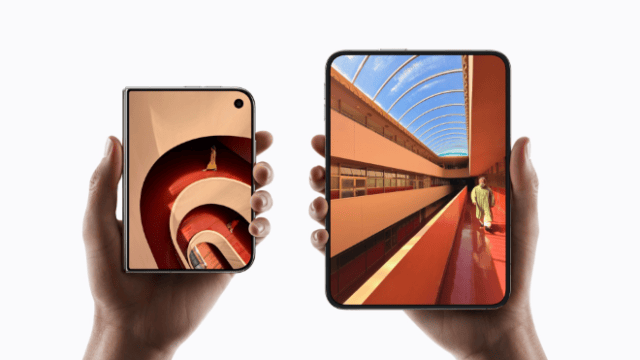
Apple’s first foldable is not meant to feel like a stretched phone that happens to bend. In an interview with creator Donald Decodes, Apple software chief Craig Federighi described iPhone Duo as a device built around continuity: what you see when it is closed should flow, almost unconsciously, into what appears when it opens. The conversation covers the see-through unfolding animation, a new hinge-angle API, Split View that behaves like two desks, and the old fight over iOS’s left-edge back swipe. Federighi’s through-line never changes. Hardware moves in space. Software should move with it. “The screen has become a window” Duo’s most discussed visual trick is the moment the outer display turns semi-transparent as the phone opens, revealing the inner screen underneath. “Our real goal there was not just an imaginary movement that you think about, but something that you don’t need to think about,” Federighi said, “so that you automatically realize the effect: that the screen has become transparent, and has become a window to what is underneath it.” He framed that as the product’s idea, not decoration. “The essence of the device idea is this continuity between your experience on the device while it is closed and your experience of what you find when you open it. So the idea that while this is happening, you are actually looking across the top screen to see what will appear below makes that journey easier in the most natural way.” His verdict: “I think it’s subtle but charming.” He has also called the same effect “subtle but magical.” The hinge is an input, not just a joint Developers can read Duo’s hinge to about five degrees of accuracy, Federighi said, with smoothing so the stream is usable. Most apps should not live on raw degrees. Apple wants them to react to pose: book, on-table, tent. “We make those things so that the developer does not have to deal with the number of openness levels. We can deliver a standard and consistent experience across applications by connecting the mode and making frameworks respond to it automatically.” Creative apps can go closer to the raw data. Apple has already shown a guitar-style demo that treats the hinge like a whammy bar. On durability, Federighi was dry: “I think we are somewhat confident, yes.” Then the line that matters for the platform: “One of the ways this device expresses itself is through its positions and its hinge, and we are excited to see what the developers will do with that.” Two workspaces, not one stretched canvas Split View on Duo is designed as two independent workspaces — each able to keep its own home screen and app switcher — that can lock together when you tap the divider. “We wanted it to be really quick and natural when you might want to keep watching, where you want to keep something on this side, while you might be switching between other things on the other side, so that you can switch between them independently. This seemed perfectly natural from a spatial perspective.” That is the same spatial instinct behind everything else in the interview. The phone folds. The interface is supposed to fold with it, not pretend the crease is extra pixels. Why the back swipe still comes from the left Users have asked Apple for years why you can’t swipe back from the right the way Android often allows. Federighi turned the question around. “People keep asking why we always have to swipe back from the left. So, what would happen if we could swipe back from the right? What terrible thing will happen?” His answer: the gesture would stop matching the motion on screen. “It becomes spatially inconsistent in one respect. I think having a spatially consistent model and having the animation really match what’s happening is an important part of providing a truly natural user experience. Therefore, we do not consider these gestures to be random actions. We think of it as a way to manipulate something physical. The logic of the device, the way things move, they slide in and out, and we try to maintain spatial consistency.” There is a practical reason too. In Safari and other hierarchical apps, one edge can mean back and the other can mean forward. “If we made both edges always for going back, we would lose the option of going forward.” Apple has already loosened the rule. In iOS 26, when a swipe is unambiguous, you can go back from anywhere on the display. On Duo, edge gestures and on-screen buttons both exist, and two-handed use makes the left-edge habit less of a one-thumb problem. The far edge remains the always-available way back because the middle of the screen is often doing something else. The developer bet: iPad, not stretched phones The risk with any foldable is apps that look like elongated phones. Federighi pointed to iPad as Apple’s evidence that its developer culture is different. “History on Android often shows that their tablet apps look like elongated iPhone apps, right? You don’t see much customization in the experience for this type of device. But if you look at iPad apps, you’ll find they’re specifically designed to take advantage of that large screen. I think this reflects the kind of standards that developers on our platform naturally adhere to as a community. And I think you’ll see exactly the same thing on Duo devices.” The tools behind that hope are familiar: UIKit and SwiftUI inheriting new behaviors, plus AI-assisted adaptation in Xcode. “When we did that at WWDC, we introduced the resizing feature in part in anticipation of a dual-screen iPhone. In our labs, developers have found that they can take their existing applications and use these AI skills to adapt to the change in size almost automatically.” “The developers’ passion for doing it right, and the ease of doing it now,” he said, “means that iPhone Duo customers will have great experiences across a wide range of apps very soon.” That is the argument Apple is making for Duo. It should feel continuous when it opens, spatially honest when you swipe, and flexible enough that each half can be its own desk. Whether the software ecosystem matches that ambition is the part Federighi cannot animate away. He can only design for it — and wait to see what developers do with a hinge that now speaks. 
Support MacDailyNews at no extra cost to you by using this link to shop at Amazon. The post iPhone Duo was designed as a window, not a folded iPhone, Craig Federighi says appeared first on MacDailyNews. You're currently a free subscriber to MacDailyNews. For the full experience, upgrade your subscription.
|




No comments:
Post a Comment